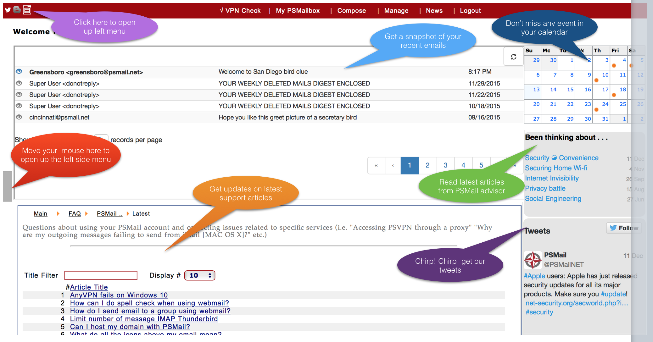
You’ve probably noticed that some changes have been made to your welcome page. At PSMail, we’re always working to improve both security and ease of use for our customers, and in this case we’ve made several adjustments designed to eliminate clutter and put the items most important to you front and center.
Here are some pointers to help you navigate this new look:
- The sidebar, with links to everything from your inbox and your calendar to preferences and support, is no longer constantly taking up screen space and cluttering the window. It is, however, still easily accessible. A new icon is visible in the top, left hand corner of your screen (it looks like a little, white file folder). This icon will open or close the sidebar as you need it.
- Your inbox is now visible right from the welcome page. This means that you can see whether or not you have new messages immediately upon signing in.
- PSMail is frequently passing on security information and warnings about specific threats. This is done primarily through our “Been thinking about…” articles and our Twitter feed. While not as high a priority for many users, these links are still visible and accessible on the welcome page and we encourage you to access whatever catches your eye as potentially of interest or use to you.
We hope you enjoy these updates and, as always, feel free to contact us with any comments or suggestions via our contact form or the “Contact Support” link in the sidebar menu.
